Since her death, there has been much discussion of Lady Thatcher’s economic and social legacy. One of her core aims was to move the UK from the post-war consensus of a managed economy underpinned by the welfare state to a more deregulated form of ‘market capitalism’. Although there have been many economic and social changes stemming from this shift – and from other policies of her government - here we summarise what has happened to inequality and poverty, both during her period in office from 1979 to 1990 and since she left and, where possible, look at how this compares to the previous periods.
Of course, the trends in these areas are the results of a number of factors – external as well as internal - and cannot all be attributed to the economic and social changes initiated during the period during which Lady Thatcher was Prime Minister.
What is clear is that the levels of inequality and poverty have both increased substantially. Since 1979, a greater share of the nation’s income and wealth has gone to top income groups, and in particular the very top, than in the period before 1979. In contrast, a smaller share has gone to the bottom income groups, and in particular the bottom decile. This shift, in turn, has been associated with growing levels of income poverty since 1979. The sharpest rises in inequality and poverty occurred from 1979 to 1990.
Inequality
Figure 1: The fall and rise of inequality, 1938/9 to 2009/10
| Top 10% |
34.6} |
21.4} |
21} |
27} |
28} |
31} |
31} |
| Second 10% |
12.7}56.9 |
14.3}48 |
14}47 |
16}55 |
15}56 |
15}58 |
15}58 |
| Third 10% |
9.6} |
12.3} |
12} |
12} |
13} |
12} |
12} |
| Fourth 10% |
] |
10.8 |
11 |
10 |
10 |
10 |
10 |
| Fifth 10% |
]27.7 |
9.6 |
10 |
10 |
9 |
9 |
9 |
| Sixth 10% |
] |
8.4 |
8 |
7 |
8 |
7 |
8 |
| Seventh 10% |
] |
7.3 |
7 |
7 |
6 |
6 |
6 |
| Eighth 10% |
} |
6.3} |
7} |
5} |
5} |
5} |
5} |
| Ninth 10% |
}15.4 |
5.3}15.9 |
6}17 |
4}11 |
4} 11 |
4} 10 |
4} 10 |
| Bottom 10% |
} |
4.3} |
4} |
2} |
2} |
1} |
1} |
Source: 1938/9 and 1972/3: Royal Commission in Income and Wealth; 1979; 1990/1 JRF 1995; 1996/7 onwards HBAI.
The 1938/9 and 1972/3 figures are not strictly comparable with the later series, and are merely indicative. The figures after 1979 are calculated after housing costs. Figures may not sum to 100 because of rounding.
Figure 1 shows levels of inequality prior to and after 1979. As measured by the shares of total net income received by individuals by decile, the UK became a more equal nation during the post war years. Thus the share accruing to the top decile fell over the 40 years to the 1979, while the share going to the bottom decile rose slightly. However, while those in the bottom three deciles did gain a greater share during this period, the main winners were those just below the top decile and those in middle deciles rather than the bottom.
Since 1979, this process of narrowing inequality has gone sharply into reverse. Between 1979 and 2009/10, the top decile has boosted its share by ten percentage points from 21% to 31% while the share received by the bottom decile has fallen from 4% to 1%. Overall, those below the top decile but in the top half held their share of income with the rise in the top being at the expense of the bottom half and in particular the bottom third. Most of these changes took place during the 1980s, but there has been some further, though smaller, increase in inequality since including during the period of Labour government from 1997 to 2010.
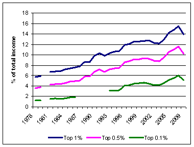
Figure 2 shows that those who have gained most from this process have been those at the very top, with the share of income received by the top 1% rising from 5.7% in 1978 to 15.4% in 2008 before falling to 13.9% in 2010. The trend in the share of income received by the top 1% has taken the pattern of a U-curve, falling from 1937 (when it stood at 17%) until its lowest point in 1978 (the start of figure 2) and then rising again. This process began in the late 1970s but continued through the 1980s, 1990s and mid-2000s before dipping at the height of the recession.
Figure 2: Share of income accruing to top 1, top 0.5 and top 0.1%, UK, 1978 - 2009
Source: Alvaredo F, Atkinson AB, Piketty T and Saez E, The World Top Incomes Database, Paris, 2012
Poverty
The level of poverty – as measured by the proportion falling below 60% of median income – doubled between 1977 and 1990 (see Figure 3). It then fell slightly from its 1990 peak of 22%, leveled off through the 1990s and fell slightly from the millennium before rising slowly again from 2006/7.
Figure 3: Levels of poverty, 1977-2010
Source: IFS
It is more difficult to track living standards over this period but the Poverty and Social Exclusion, and the predecessor Breadline Britain, surveys provide comparative information for the years 1983, 1990, 1999 and 2012. These surveys find that using a measure of poverty based on the public’s perceptions of necessities, there has been a rise in the proportions of people falling below these publicly set minimum standards. The latest 2012 survey also finds that in some key areas, levels of deprivation, in particular housing, are back at 1983 levels. For more details see Facts and Findings 2: Going backwards: 1983 to 2012.
The reasons for these trends are, of course, complex and for over a third of the period since 1979 a Labour government has been in power. What has been happening is that rising prosperity over the last 30 years has become increasingly unevenly shared, with more of the gains of growth going to those at the top, leading in the process to a more unequal society.
We'd like to thank Ruth Levitas for the data for figure 1.


 PSE:UK is a major collaboration between the University of Bristol, Heriot-Watt University, The Open University, Queen's University Belfast, University of Glasgow and the University of York working with the National Centre for Social Research and the Northern Ireland Statistics and Research Agency. ESRC Grant RES-060-25-0052.


